EST 2025
Loading the experience
  • Work
  • Tech
  • About
  • Contact
Hello
  • Work
  • Tech
  • About
  • Contact
Hello
Skip to content
MERIDII
Meridii
Let’s talk →hello@meridii.com
We respond within two business daysBooking Q2 2026
Navigate
WorkTechAboutCareers
Contact
FAQ
Legal
PrivacyTermsAccessibility
Studio
Toronto, Ontario
Canada

Experiences that turn strangers into regulars

© 2025–2026 Meridii · All rights reserved
Meridii™ · BN 790 776 975

Kuro Hana

Art Direction · UI/UX Design · Front-End Development · CMS Integration
Kuro Hana
Kuro Hana color palette

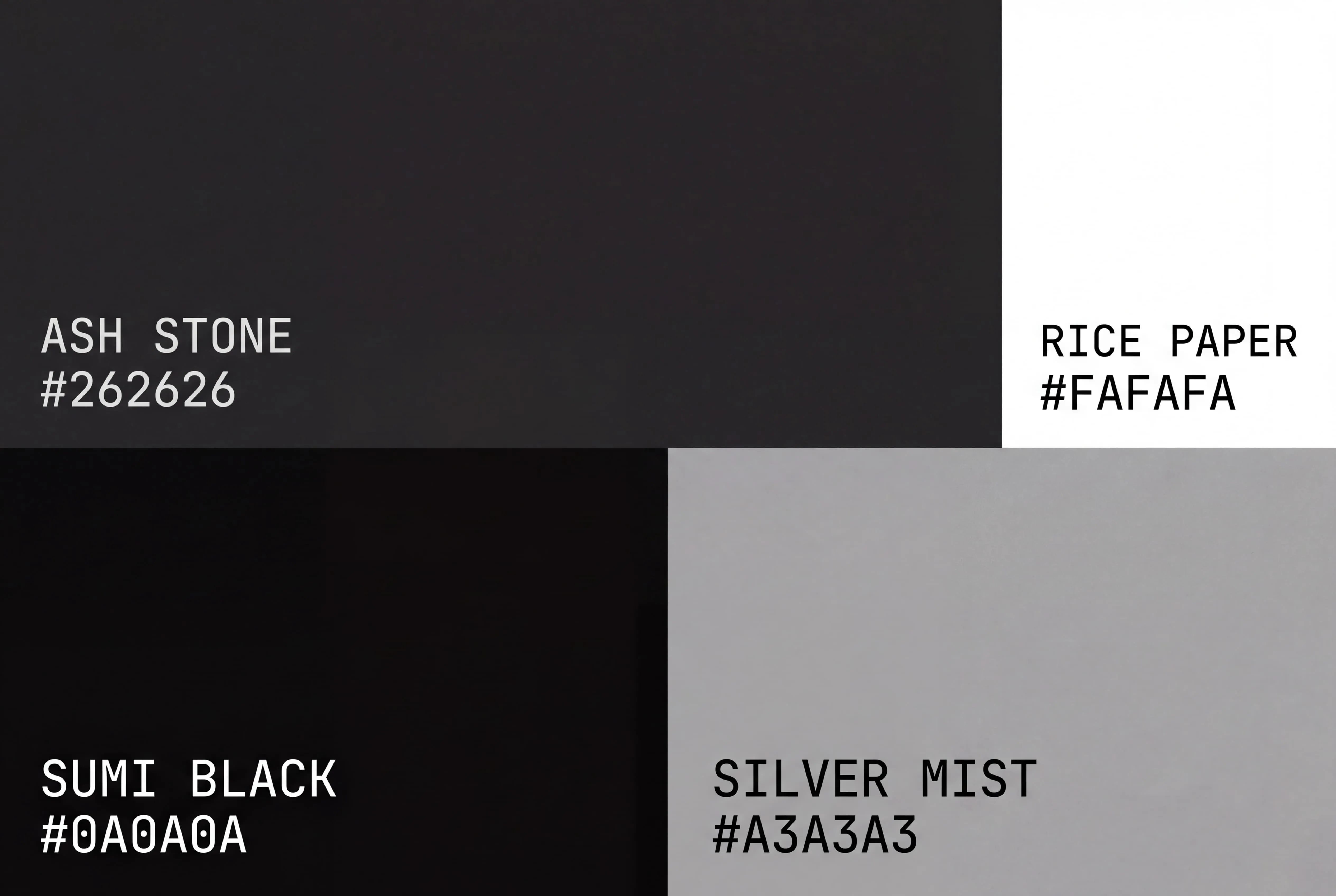
Ash Stone #262626, Rice Paper #FAFAFA, Sumi Black #0A0A0A, and Silver Mist #A3A3A3 keep Kuro Hana grayscale. The palette stays quiet so the food, tradition, and reservation details can carry the page.

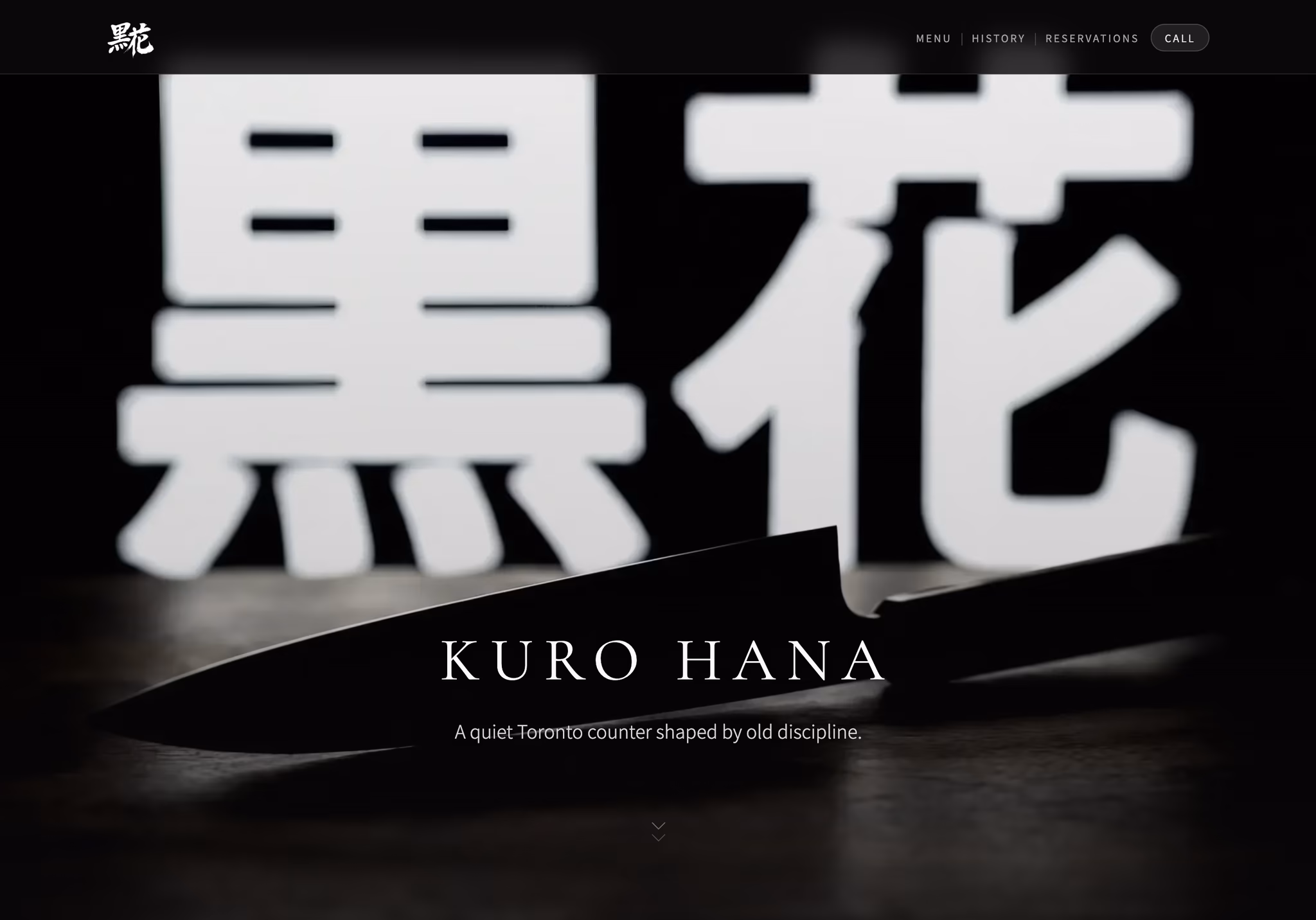
Kuro Hana is a Japanese omakase counter in Toronto built around tradition, precision, and restraint. We wanted the website to feel the same way. No loud colors, no gimmicks, no over-explaining. Just a quiet, confident page that helps someone understand the experience and feel comfortable reserving. In a category where the meal is intimate and expensive, restraint is part of the trust.

Live at
kurohana.ca

Go see how Kuro Hana feels in motion — it’s better in person.

History before the reservation

Kuro Hana's guests are not only paying for dinner. They are paying for tradition, attention, and a certain kind of seriousness. Before they reserve, the site needs to make that visible. The history page tells the story of the kitchen and the tradition behind it, with a slow timeline that feels unhurried on purpose. The visitor should feel the weight of the experience before they see the menu.
The history page, eight seconds of unhurried bilingual reveal.

A menu that moves slowly on purpose

On the homepage, menu elements slide past in two slow rails. Nothing jumps out or begs for attention. That is the point. A flashy interaction would make the restaurant feel cheaper, not better. Restraint signals confidence, and confidence matters when someone is choosing an omakase counter for a special night.
The dual-directional menu carousel on the homepage.

Fast because the guest expects care

An omakase guest notices care. They may not think about page speed, but they feel when a site is slow or sloppy. Kuro Hana loads quickly and keeps the interface lightweight because the digital experience should match the discipline of the meal. Even the tiny header arrival is measured. The site should feel as careful as the counter.
The header on arrival, restraint at the scale of 40 pixels.

Explain the ritual without overexplaining it

For first-time guests, omakase can feel intimidating. What do I wear? When do I arrive? Do I order anything? We made the menu, etiquette, schedule, and booking details easy to find without making the experience feel casual. The 12-course arc and seasonal highlights are managed through Sanity, so the chef can change the menu and the website follows. No stale pages, no nervous first impression.

Bilingual without hiding either culture

Japanese and English sit together throughout the site instead of hiding one behind a toggle. It is a small choice, but it says a lot. The restaurant exists between cultures, and the page should honor that clearly. A respectful detail can do more for trust than another paragraph of explanation.
Delivered
November 2025
← Previous caseShawarma MaxNext case →Yapr