Novae Dental Studio
Brand Strategy · UI/UX Design · Front-End Development · Motion Design
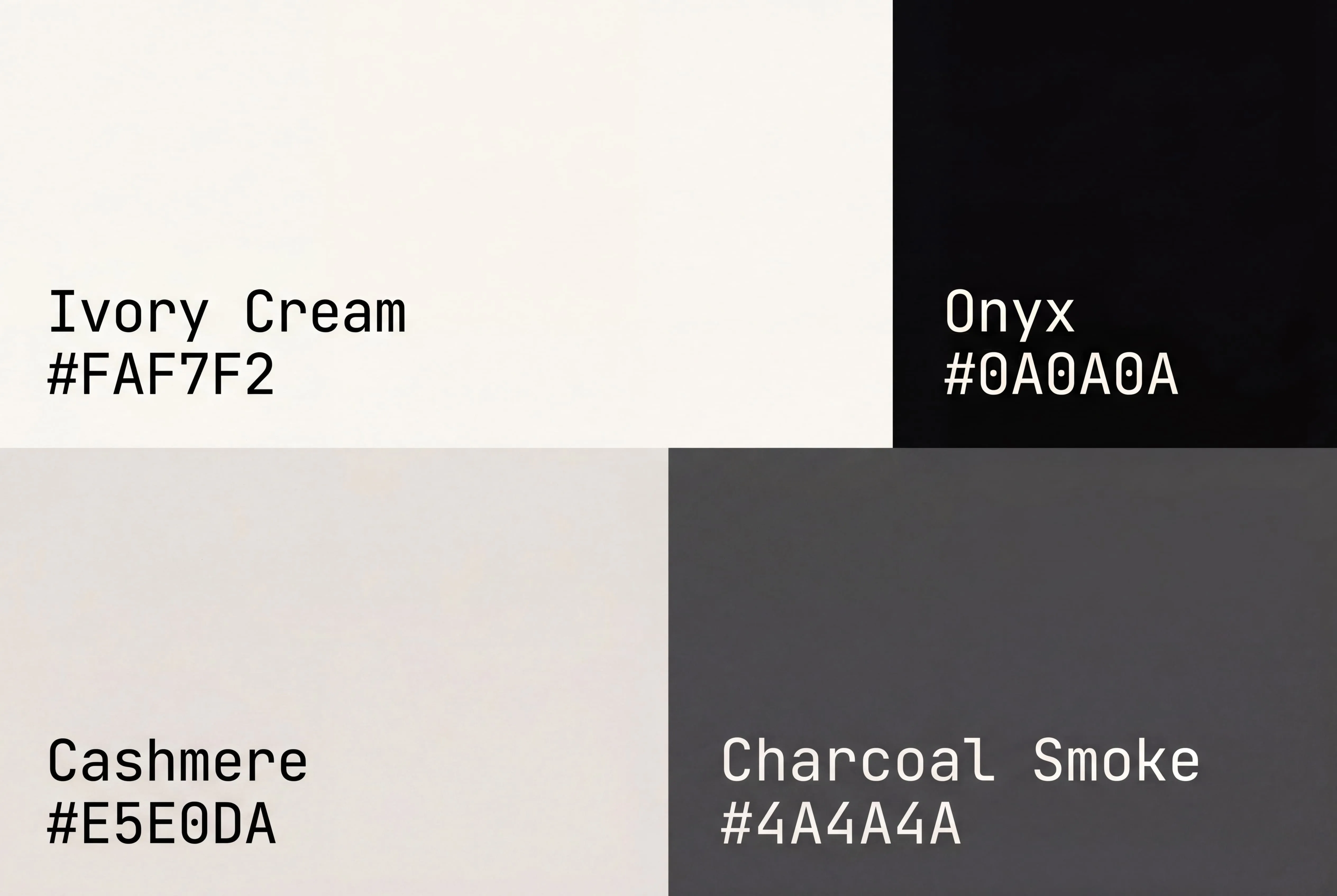
Warm cream (#FAF7F2) and near-black (#0A0A0A) with Playfair Display italic accents. No jewel tones, no medical blue — the palette earns its premium feel through restraint.
Novae Dental is a Yorkville studio with a 4.94 Google rating and a quietly obsessive tech-first approach. We built them a website as warm and meticulous as the experience they deliver — because the site's job is simple: turn the dread of a dental visit into a booked appointment, every single time.
Live at
novaedental.com Go see how Novae Dental Studio feels in motion — it’s better in person.
Speed as a feature
People looking for a dentist are often in some kind of pain — and pain has no patience. The Novae team was clear from day one: they wanted the fastest dental site in the city, no compromises, no excuses. So we built it to load before a visitor has a second thought about trying a different clinic. Every millisecond of hesitation is a competitor's gain. In this category, load time is a conversion lever.
Approachable, never sterile
The Yorkville patient base includes families, first-time adults, anxious kids, and people who haven't been to the dentist in years. A cold, clinical site tells all of them to keep postponing. So we went the other direction — warm cream tones, generous photography, editorial Playfair Display headings that feel premium but human. Even kids on the homepage can tell this isn't going to be scary. The kind of site where you finally book the appointment instead of putting it off another month.
A services menu people actually enjoy
Most dental sites list services like a medical textbook — a wall of clinical terms that forces the visitor to self-diagnose before they can ask for help. We flipped the pattern. A visual, asymmetric gallery lets visitors recognize their own problem in the photography first, then learn the clinical name afterward. Recognition is confidence. Confidence is the booking. Twelve complete service pages, every one held to the same standard as the homepage — because the visitor three clicks deep is the one closest to picking up the phone.
The questions you'd never ask at the front desk
Medical services have to be transparent — especially in a category where patients arrive already bracing for bad news. Every visitor has a mental list of questions they're a little too embarrassed to say out loud: how much is this going to hurt, how much is it going to cost, how soon can I eat afterwards. So we built FAQ sections into every service page, pre-answering the anxious questions before anyone has to ask. The person who knows what to expect is the person who picks up the phone.
Hard not to brag
When your Google reviews already sound like marketing copy you paid for, it's difficult not to show them off. Novae earned their 4.94 rating the hard way — one nervous patient at a time — so we built a living review carousel that rotates real quotes from real patients right into the homepage, at the moment hesitation peaks. Social proof is the fastest trust signal on the internet. Every word was already written. All we had to do was make sure no visitor could miss it.
Crafted motion, everywhere
Yorkville patients expect premium. Restraint and craft signal investment — the kind of investment that lets a studio charge what they charge without apology. Character-by-character hero animation with staggered cubic-bezier timing. A living header that breathes with the scroll. Dual-motion image reveals combining clipPath wipes with internal zoom. Every transition hand-tuned. Every second of motion earning the price point.
A dental site should feel clinicalwarm.
Delivered
January 2026